

Our digital info is scattered across messy and disconnected storage systems. As it piles up, our files get harder to find, and thus harder to share with others. People use their drives differently so there’s no one-size-fits-all solution.
Kernel lets users store, share, and collaborate on digital files, all in one place. Users’ needs & approaches vary, so Kernel enables them with multiple search-options and flexible views. Easy previewing and auto-sorting saves time and energy so users can focus on their real goal.
Challenged with finding a spot in the already-crowded Cloud Storage market, my work began with researching the competition and habits of those who could benefit from the project.

First I studied existing cloud storage systems out there to see where Kernel could fit in:



The competition is tough with giants like Google and Dropbox, but they are both very focused on text and not so visual. To be successful, a new product would need to be distinct, fun, visual, while keeping functionality simple and clear. See the full analysis here.
I employed a short survey to investigate how people currently use Cloud Storage systems and other relevant habits. How do they save important things they find on the internet? Do they share these files with others, and if so how? What problems do they run into? Are they interested in getting more organized, or having a single storage spot for everything?
My 40 respondents indicated that while they already use a cloud storage system, they're open to new and improved ones. The survey validated the project premise and provided insights into how people actually use these products, and what real people are actually looking for. See the survey and the results here.
Based on the overarching trends of my survey, two distinct personas emerged, each with different needs from a cloud storage system:


Both personas want quick visuals of what the files they need, but their use of folders is where they diverge. Skipper would rather have her files automatically-organized for her, saving time and mental energy. Michael’s company uses a stricter file management protocol and will be setting up his own folders accordingly so that his team is all on the same page.
Equipped with my Cloud Storage market research and fleshed-out User Personas, I started building the features that would make up the app, tailored to real users’ needs.
I created a list of User Stories, actions that our users would need to undertake while using the app, and then sorted them by priority. At the very top of these priority lists were account creation, adding files to their storage, and searching these files out. As a revenue generator, it’s imperative users are able to upgrade to a paid-subscription account. See all the user stories here.
This process prescribed the minimum viable product for Kernel to be successful: a cloud storage app where users can upload and store, view, download, and share files. Users can decide how to specifically sort their files, or let the app take care of it for them.
I diagrammed flows of the most high priority user stories to make sure these tasks could be accomplished quickly and without too many clicks. Additionally, I wanted to include multiple routes to find files, based on a given user’s preferred approach. I built the Sitemap to flesh out all the screens that would require wireframe modeling. Check them out here.
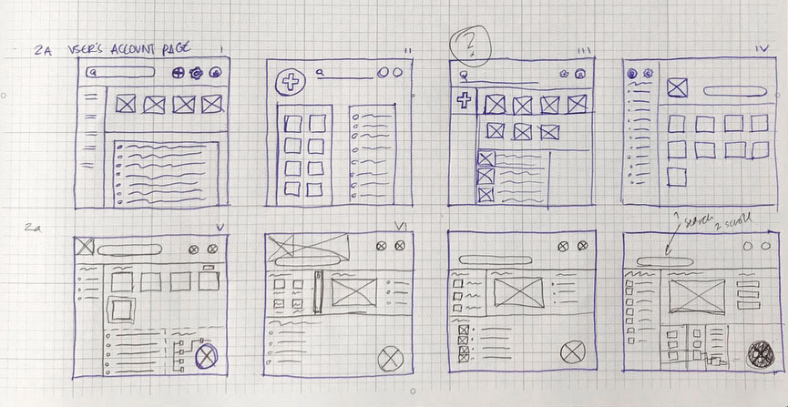
I sketched many iterations of Kernel’s dashboard, with the following primary goals:
I then translated my paper sketches into rough digital format using Balsamiq.
I then recruited subjects for remote usability testing. This quickly identified some trouble spots:
I’d have to invite the users down the page to make the Welcome Page more clear. I needed significant adjustments to the dashboard to keep things simple. With this initial feedback on the basic interface, I was ready to start crafting the product's identity.

Kernel needs a modern aesthetic that shows it can compete with its competitors like Google Drive and Dropbox, by infusing it with bold colors to stand out, with an illustrative style to maintain a light-hearted sensibility.
I mind-mapped concepts and sketched ideas to zero-in on a popcorn bucket - and the metaphor of a kernel as an idea that our users want to store. Rather than going too literal- my logo developed from the idea of the kernel bursting into it’s popped shape, and melding that with the letter K. I chose Dosis for the Logotype, button text and technical information, while using Lato for paragraph and conversational text.
See some more in-depth preference tests I ran here.
PEPPER PURPLE
#1E1651
SRIRACHA RED
#FF3864
GILDKERNEL
##F4C95D
SUNBUTTER
##F1FF7A
SALTMINE
#EFEDCE

Using the Invision App, I created a Hi-Fidelity prototype to test both its functionality and it's visual design.
I recruited four subjects to execute tasks in my Kernel prototype.
They were successful at their specific tasks, but the purpose was still unclear. As much as the bold “GET STARTED” button directed them, they wanted to interact with the top right of the Landing Page in a way that they could not. I also realized that the Home Page rolled out the content too slowly and I was forcing my users to piece together a puzzle, rather than properly introducing them to Kernel. I’d still have to make some changes. See my test notes here.
Personally I felt my dashboard was a little bland, and wanted statistical feedback to justify more color. The results were overwhelmingly in favor of more color - but one “against” comment stood out:
I took this conceptual critique of the dashboard and applied it where it was really needed: the landing page. The saturated and bold colors weighed it down and had the wrong feeling. I decided to give it an overhaul based on what I’d learned.
I pulled out 90% of the background color to let the Landing Page breathe. I realized not every color from my scheme’s arsenal needed to be applied, which simplified everything. I built a Features List which not only spelled out what Kernel is specifically about, but also lead the viewer further down the page. I took a more Responsive Design approach and considered how the static assets would condense as the browser shrinks. Finally I condensed and simplified the vertical real estate at the top of the dash.
I fleshed out and expanded the access to the sign up process - further delineating the specific information needed for each plan. As the user signs in for the first time - the empty states guide the user to action.
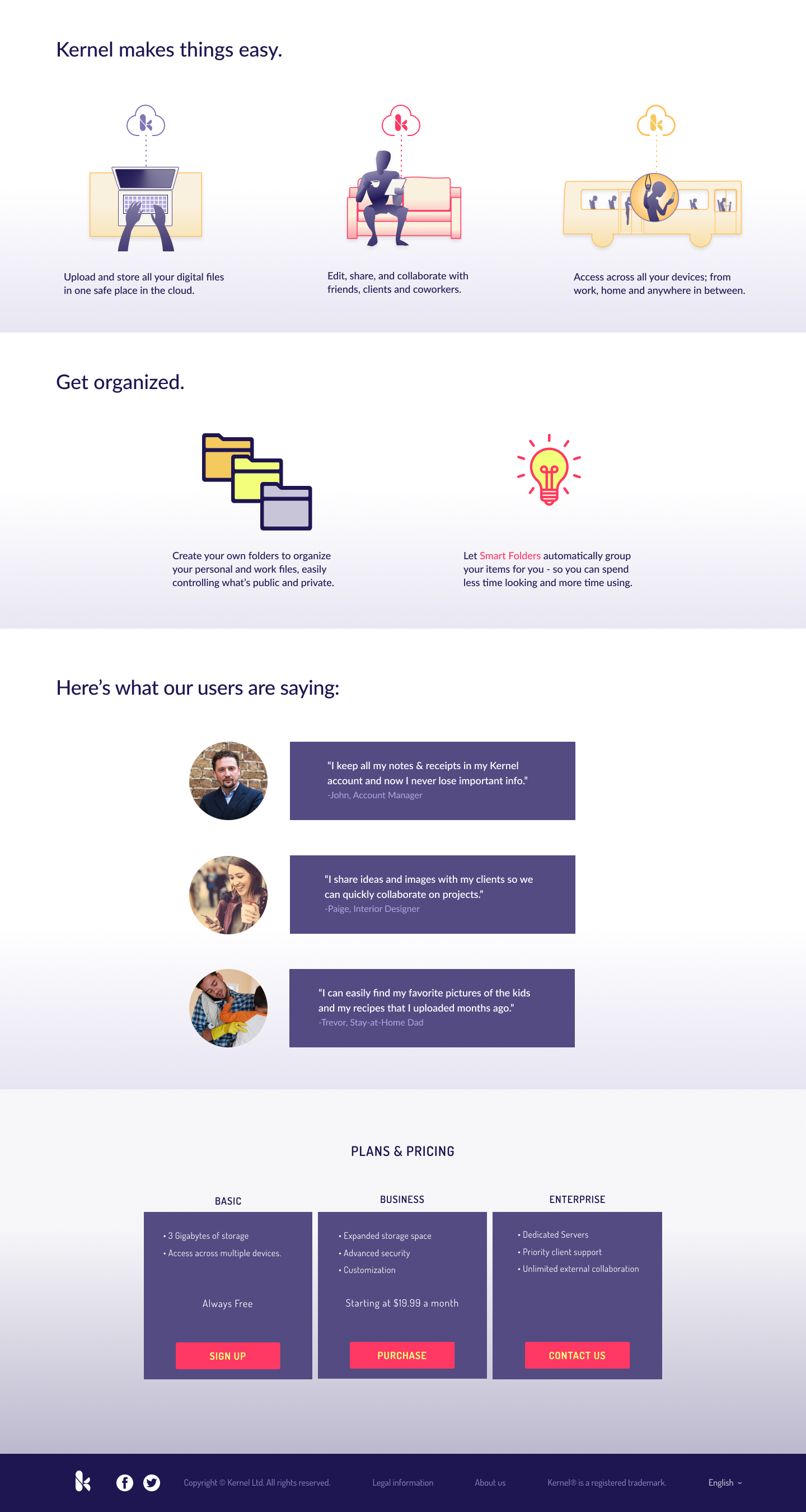
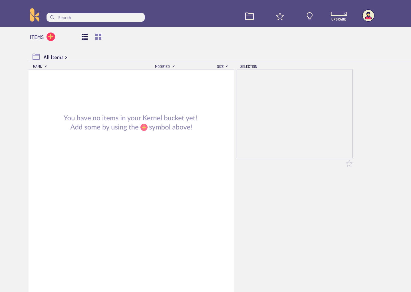
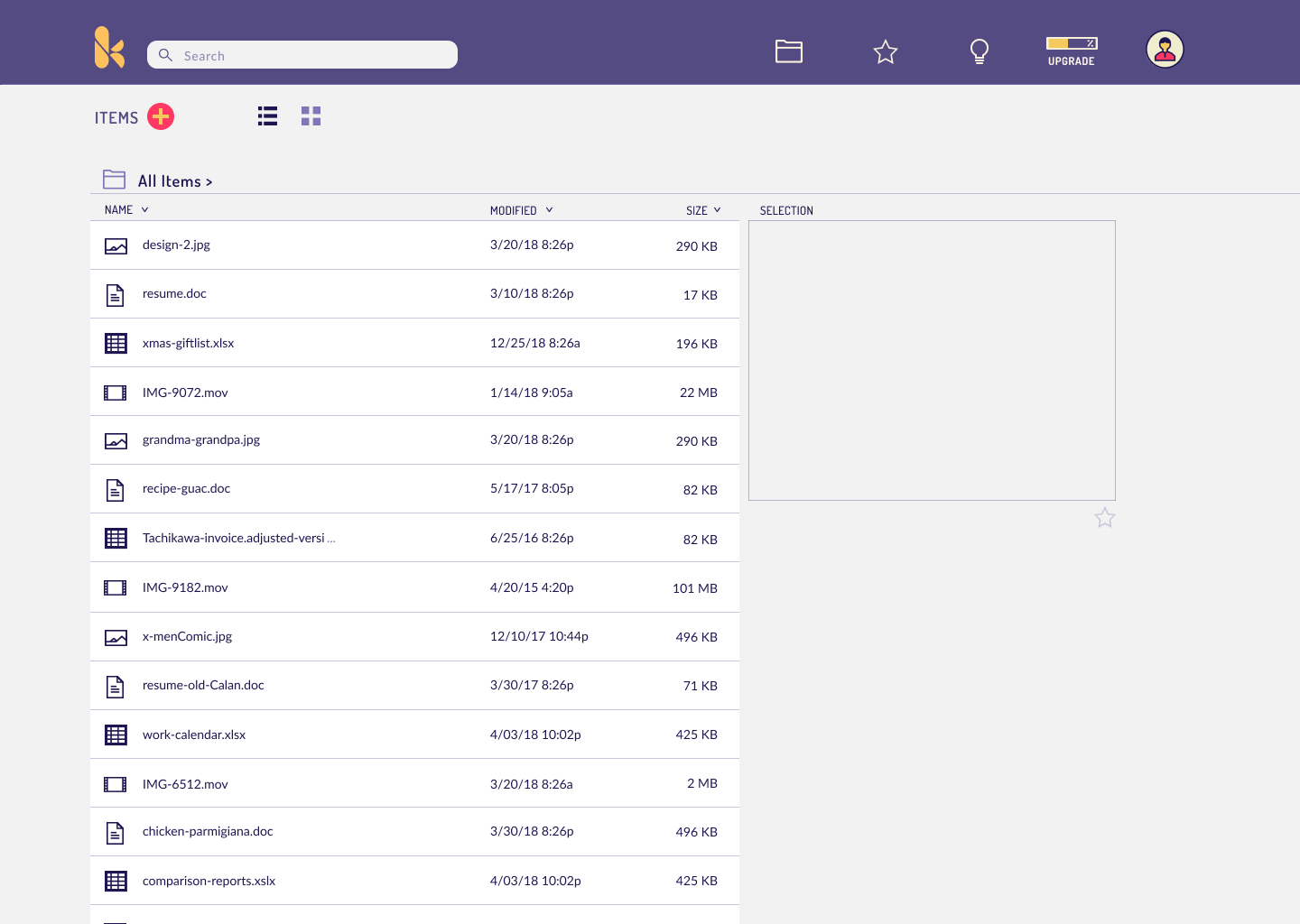
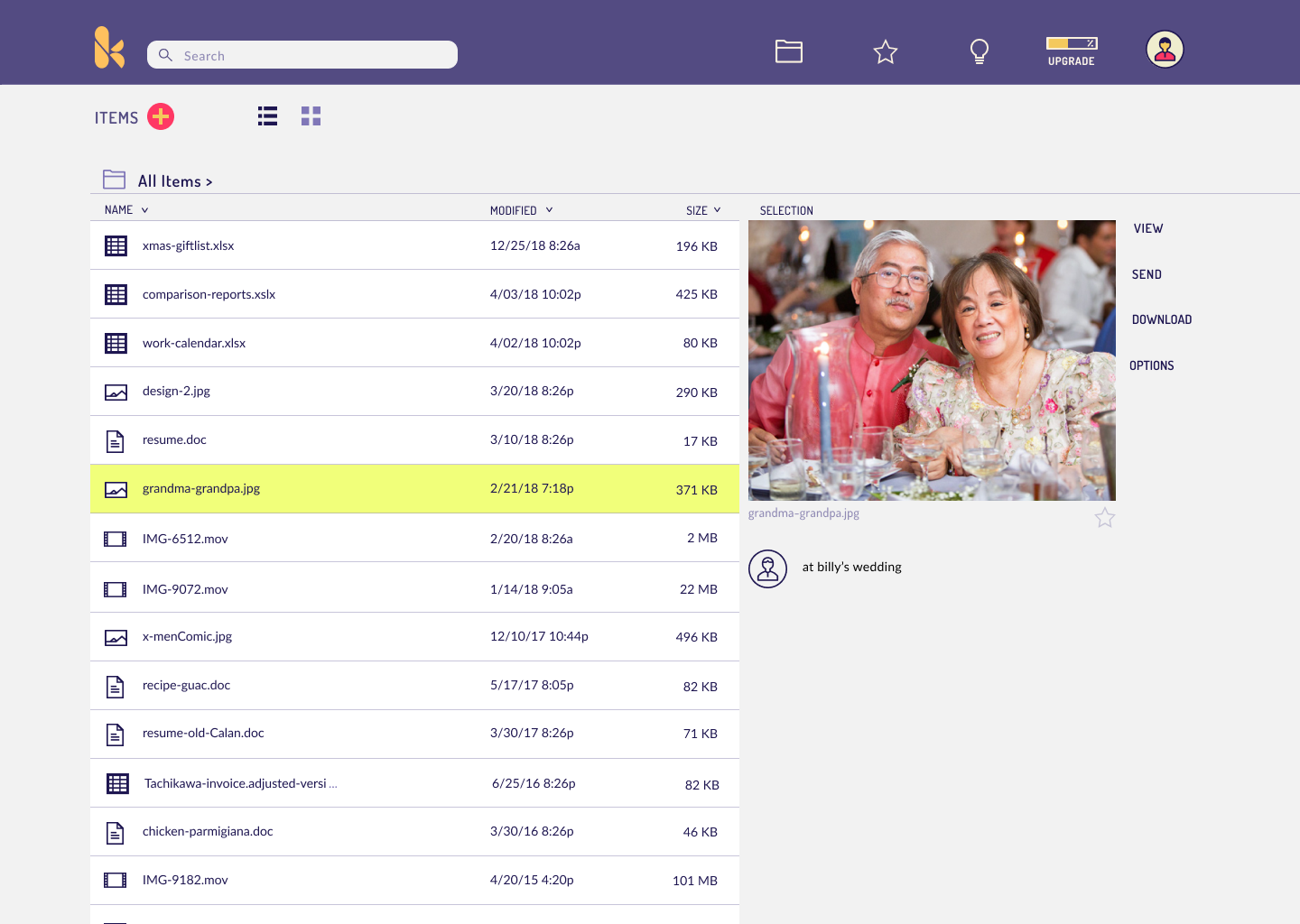
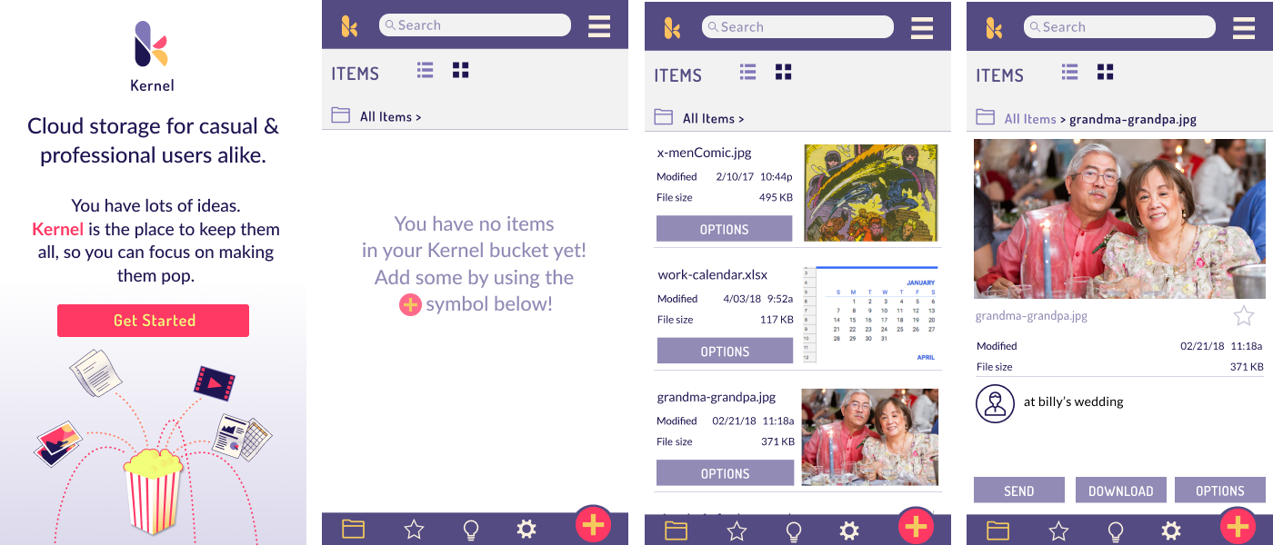
Kernel’s logo, branding and visual design created a distinct product feel. The UI proved itself to be intuitive and navigable in repeated tests. Its array of features satisfy our client’s MVP and make Kernel a contender in the cloud storage marketplace.
More time spent in the initial research and ideation phase could have yielded a sharper concept to set itself even further apart from the competition. Specifically by using follow-up surveys to dig even deeper into existing user habits, and zoom in more closely on a target demographic.
With more time, I would like to carry the illustrations further through the app, and refine them through more iterations. Finally, the most valuable learning came from the feedback of others. Outside points of view revealed the sharpest insights to the problems at hand.